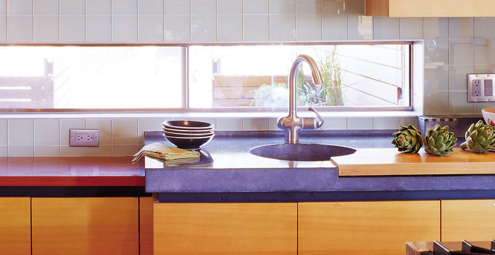
One Material Has You Covered From Traditional to Modern
Quick Tour of Concrete
Concrete has been a cornerstone of construction for centuries, shaping everything from monumental bridges and skyscrapers to sidewalks and roads. Beyond its structural role, concrete has long been valued as a decorative material in architecture. In the 1920s and 1930s, it filled many of the sculptural roles once reserved for stone, serving as an affordable alternative to granite and marble. Craftspeople created elaborate molds to form columns, capitals, balustrades, and neo-classical façade details.
Inside buildings, concrete was equally versatile—appearing as terrazzo, acid-washed, or smooth-troweled floors, as well as fireplaces and other architectural features. Many early 20th-century structures combined concrete’s strength with intricate detailing, merging classical inspiration with the modernity of the time.
By the mid-century, Modernism shifted architectural priorities. The pared-down aesthetic of the 1950s and 1960s reduced the decorative role of concrete, focusing instead on pure function. While this minimized craftsmanship in many buildings, it also set the stage for a future revival of creative expression.
That revival is underway today. Tools and techniques once reserved for specialists are now widely accessible. Acid washes, stamping tools, polyurethane molds, reinforcing fibers, diamond polishing pads, rapid-set mixes, and water reducers have made it possible for both professionals and DIYers to create concrete work that is as expressive as it is functional
Breaking the Mold
Concrete’s presence in kitchens and bathrooms is still sometimes viewed as a modern innovation, yet the material has deep roots in traditional design. Its adaptability allows it to blend seamlessly with various styles—minimalist, rustic, or classical—depending on how it’s finished and combined with other elements.
Design styles are best understood not as rigid templates, but as collections of details that work together to create a mood or identity. For example:
-
A stone hearth, shuttered windows, and hanging herbs may evoke a French countryside kitchen.
-
Glass cabinetry paired with white porcelain fixtures can suggest a Victorian aesthetic.
-
Removing ornamentation altogether can lead to a Shaker-inspired look.
Concrete fits easily into these design conversations. It can serve as a substitute for traditional materials or be paired with them to create a timeless effect. Decorative edges, tile inlays, or embedded artifacts can add a sense of history without imitating the past.
Design with Balance
In most American homes, kitchens lean toward some form of traditional or transitional style. Understanding the origins of these styles—how form, craft, and technology shaped them—helps ensure that design choices feel authentic rather than forced. Elements used without context, such as decorative columns with no functional or structural purpose, risk falling into what might be called “costume design”—a nostalgic imitation rather than a timeless expression.
Good design balances restraint with character. A kitchen layout with strong proportions can easily shift between traditional and contemporary by adjusting finishes and materials. For example, changing a tiled counter to concrete or simplifying cabinet doors can transform the style without altering the underlying “bones” of the space.
Similarly, combining modern elements like stainless steel with traditional touches such as tile inlays or classic cabinetry can create a harmonious “transitional” look.
Example:Integrating Concrete into a Craftsman-Style Kitchen
In a period-appropriate Craftsman kitchen, typical features might include frame-and-panel cabinetry, wood wainscoting, tiled backsplashes, and warm lighting. Concrete surfaces can complement this look with the following approaches:
-
Choose earth tones or natural grays—avoid overly bright colors.
-
Keep the countertop edge between 2½″ and 5″ thick.
-
Add shallow inset panels to reflect cabinet door shapes.
-
Recess proportioned ceramic tiles into the countertop face or backsplash.
-
Create inlaid mosaic tile “trivets” near the stove.
-
Line sink drainboards with tile or marble.
These details should be used selectively to maintain balance and avoid visual overload. In spaces with heavy ornamentation—such as an elaborate English manor–style kitchen—simplifying the design with a plain ogee-edged concrete countertop and a porcelain farmhouse sink can bring elegance without excess.
Share This Post

