Share This Post
Two Units Combined Into One Vision
Project Timeframe: 1 year from design to completion
Building Material Highlights: Concrete, Reclaimed Koa, river washed granite, raw steel, 3 form translucent panels, custom ceramic tile, Mexican pebble tile, cedar
Pro-Formula Colors: Sand, Olive, and Charcoal
Project Location: San Francisco, CA
AN INTERVIEW WITH THE DESIGNER
CONCRETE EXCHANGE: What was the biggest challenge of this project?
DESIGNER: Well, to begin with, the client was scared of “modern.”
CX: Why did they come to you if they were scared of modern?
DESIGNER: The project came through the contractor. At first, the client couldn’t see the aesthetic continuity—that the strengths of traditional style that speak to them—like craftsmanship, quality and warmth, sense of proportion and scale—could work hand-in-hand with modern characteristics like a fresh approach to materials, a new perspective on luxury, composition, and the intentional use of open space.
I had to work hard to help them understand that you can blend these strengths to create something both clean and warm. With a modern touch, we can create areas of calm and areas of excitement through materials that have contemporary flair but also pay homage to tradition—and I think we did just that.
KEY DETAILS: in the Kitchen and Master Bath
CX: Seems like the kitchen got a major facelift, what are some key ideas here?
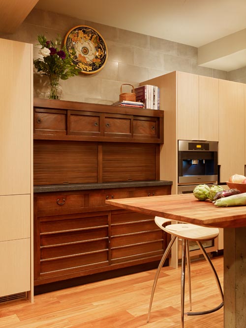
DESIGNER: The client has an appreciation for antiques and the quality they bring. I wanted to honor that and envisioned using a tansu chest as a major focal point in the kitchen. It’s ideal because the scale of the tansu is based on multiple functional levels with several layers of storage—it naturally lends itself to compartmentalization.
To modernize its use, we added roll-up doors, pull-out drawers, and topped it with a slab of river-washed granite. It’s a perfect example of an antique with a strong history brought into modern functionality with just subtle changes in detail.
The almost-not-so-funny thing was that I designed the kitchen with space for the tansu before I found the right piece! I assumed the dimensions would be typical, but antiques are rarely standard. What luck—at my favorite place for Japanese antiques, I found one within half an inch of the space I’d designed. First piece at the first place I looked—it was meant to be.
CX: That seems like a close call! The rest of the kitchen seems to have a lot of detailed nuances, can you describe a few?
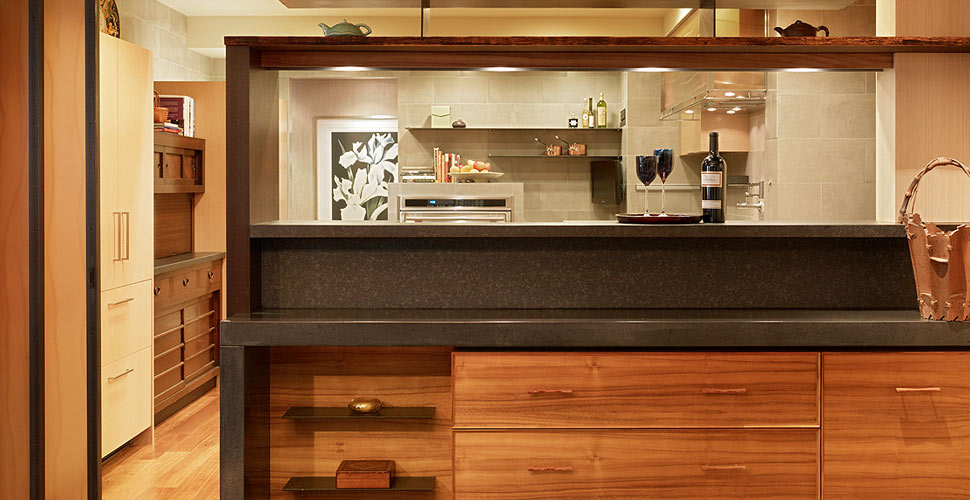
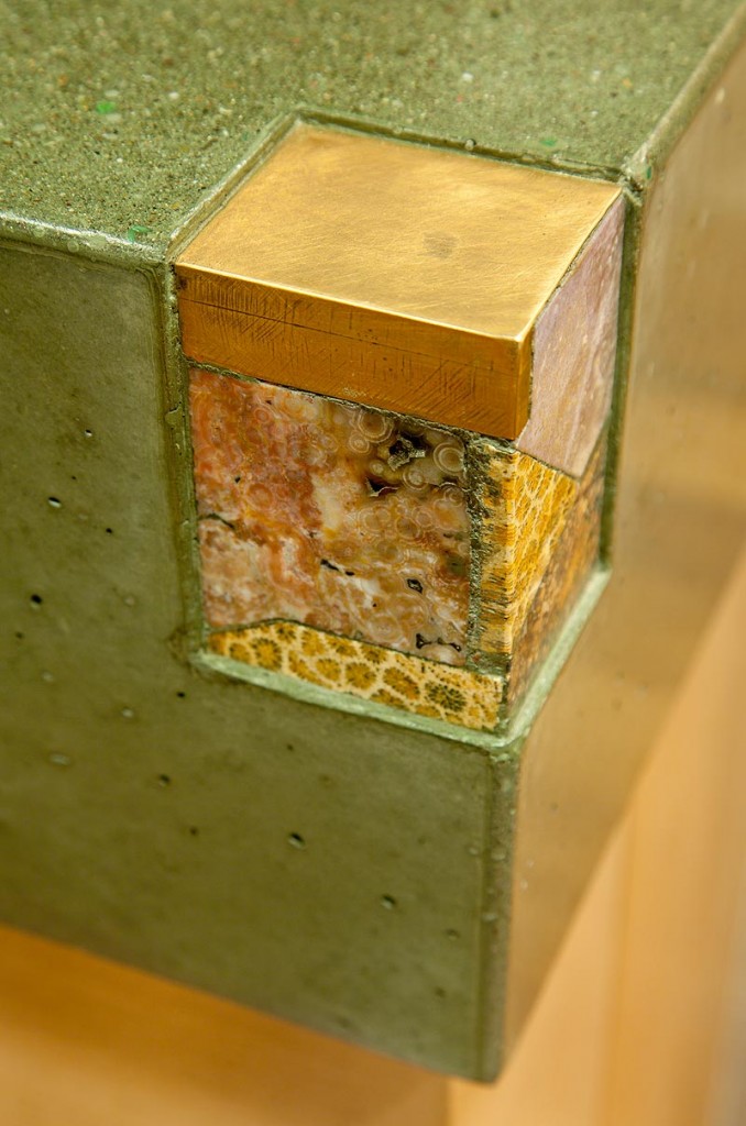
DESIGNER: The client’s husband sits at the island while she cooks and they watch TV. He’s very tall, so comfort was essential. The reclaimed koa wood island top curves down like the bottom of a boat, allowing it to cantilever for extra legroom. A beautiful piece of petrified coral is integrated into one corner—a perfect little find in both color and texture.
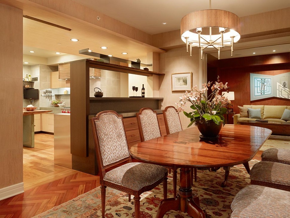
Just beyond the island is the sink area, where there used to be a wall. Opening it up brought the cityscape into view, dramatically increasing natural light. On the far side is a raw steel shelf and a built-in formal dining buffet wrapped in Charcoal-colored surface material. Hidden sliding doors can close off the dining area for more formal occasions.
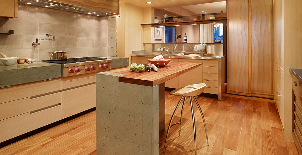
The 3form translucent panel used in the kitchen hood is the same material as the sliding doors. A hidden spice cabinet is tucked behind ceramic tile to the right of the stove. The kitchen is full of small, hidden details—little “aha” moments you discover over time.
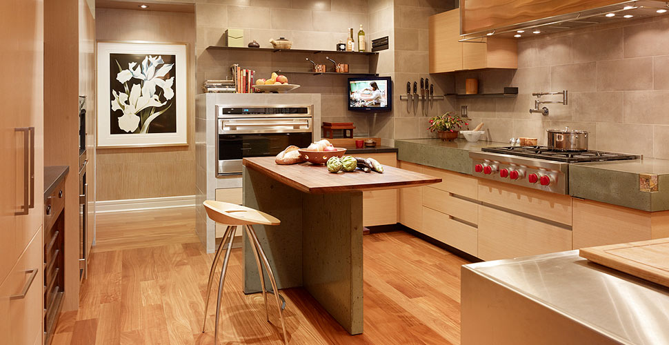
CX: There are a lot of various materials you just described, any other interesting material call outs?
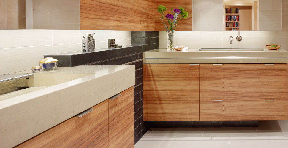
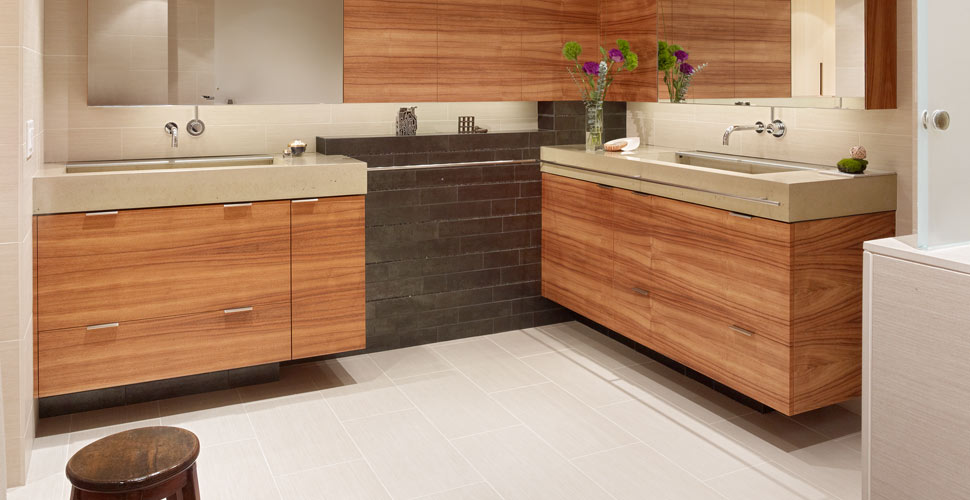
DESIGNER: In the master bath, we used reclaimed koa and black subway tile detailed with Mexican pebble tile. The his-and-hers vanities are a modern interpretation—they’re not a side-by-side traditional dual vanity. They’re made with Sand-colored CX Pro-Formula Precast Concrete Countertop Mix. There’s no hardware on the uppers, which keeps the lines clean, and everything is done in warm woods.
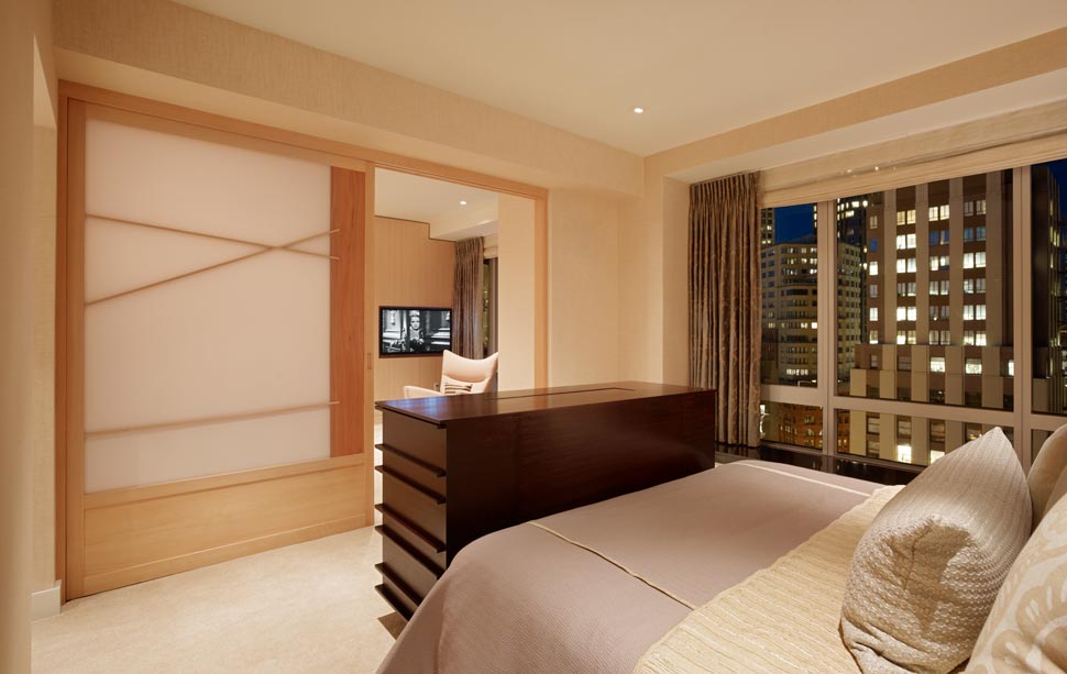
Cedar was used for a modern take on 10-foot-wide shoji panels in the bedroom—another example of reinterpreting traditional forms. In the study, bamboo shelves were built with subtle metal details for a refined contrast.
THE GIVE + TAKE: Project Lessons
CX: What is your favorite area or “aha moment” of this project?
DESIGNER: I love the experience of walking into the space from the outside—it’s like stepping into a completely fresh palette, a breath of fresh air. It’s rewarding to see how far it’s come from what it was before. My personal favorites are the kitchen island, the desk in the study, and the way the bathroom came together.
It’s incredibly satisfying to deliver something the client didn’t expect, but ultimately loves—so much so that they’ve hired us for another project.
Share This Post
