Share This Post
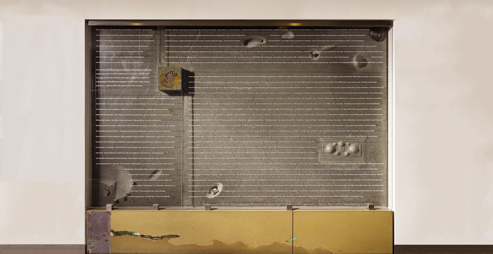
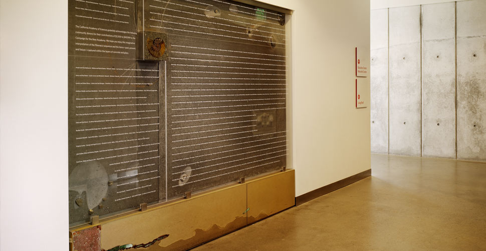
Concrete Wall Combines Art and Science
Project Scope: Design secondary donor wall for California Academy of Sciences
Project Timeframe: 6 months
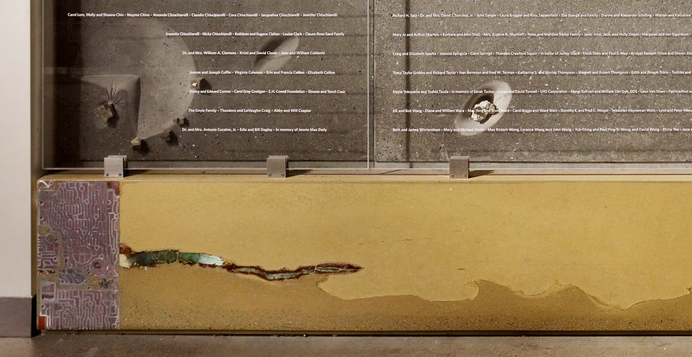
Building Material Highlights: CHENG Countertop Pro-Formula, 9” ammonite, pyrites, car transmission, chrysoprase, glass
Pro-Formula Colors: Charcoal, Amber and Chianti
Project Location: Golden Gate Park, San Francisco, CA
AN INTERVIEW WITH FU-TUNG CHENG
How exactly did you come about this important commission?
Fu-Tung: Pentagram did the graphics for CAS and there was a team there we’ve worked with before and knew our work with concrete. They did the new logo for the museum and they needed me to consult on their idea to do the logo with a stain on the concrete area leading up to the entrance. The concrete had already been poured so there weren’t a lot of options here, but I told them that going with a stain was a bad idea. They expected 1.6 million visitors a year; after just a few thousand, that stain would be gone. I told them to cut into the existing concrete and inlay something harder than the concrete itself. So they did that, cutting out the existing concrete and inlaid different colors of granite.
So after this small consultation, the Pentagram group approached me saying they “wanted something in concrete” for a secondary donor wall, but they didn’t know exactly what they wanted. This was a chance for the smaller donors and they needed something visual as an entry to the living roof. They had no concept except that they wanted concrete. This, of course, was my chance to be part of something as important as this building and the institution—a chance at a blank canvas and no preconceptions for the outcome!
So a blank canvas was handed to you, where there any challenges at all to start?
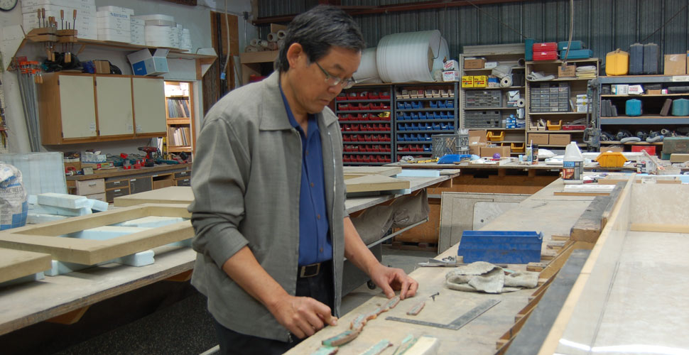
Fu-Tung: This was the “people’s donor wall” so it needed to be appropriate for the museum, but not be overly done and ostentatious such that it overpowered the main donor wall. At first, they just wanted to emboss the donor names into concrete, but there are so many names and yet so little margin for error with many small letters. Resolution, once translated into the concrete, could have been an issue.The best thing was to design a base and backdrop in concrete—these were the basics. And the idea of the donors names floating over the concrete in glass, well, that was a way of “elevating” them—I knew their names would cast dramatic shadows onto the concrete. But, the structure of this area was not originally engineered to withstand the weight of concrete so I needed to work within weight limits and engineering restrictions.
CREATING CONCEPTS + FORMS 
What was the concept for the donor wall and how did you arrive at it?
Fu-Tung: I wanted to create a “landscape” with multiple dimensions that was subtle on the one hand so that you’d be able to read the donor names, but then captured the spirit of CAS as an institution of, and tribute to, science, art and nature—and that’s why the Golden Mean and the Fibonacci series is central to the concept because rare are the phenomena found across science, art and nature.
To tell that story of ideal proportions, I inlaid a rare, giant ammonite within a square that rises up, like a mesa, from the concrete landscape to meet the surface of the glass. From there, the visual stories spiral out from the energy of the ammonite and the golden ratio.
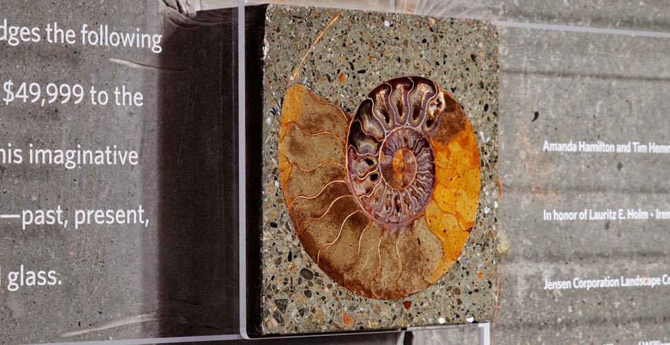
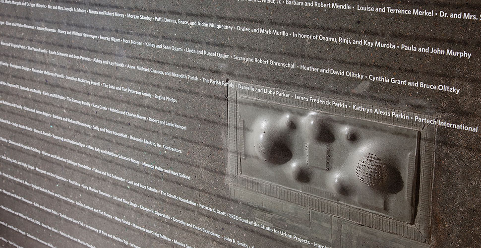
In one corner we recreated the undulating topography of the Academy’s living roof, which represents the seven hills of San Francisco. That was interesting getting the images from Google and then using it to translate it into the fabric form for the concrete. The entire wall represents the Academy and aspects of the geological, planetary—earth- and moon-like—even astrological and just a touch of levity thrown in for fun.
You mention a fabric form?
Fu-Tung: We made a fabric-formed mold for the entire wall, especially to get the replication of the living roof, made to the exact same proportions at a smaller scale. And there’s really no other way to translate a true three-dimensional visual story with amorphous, organic shapes in contrast to the monumental, solidity of the material. Using fabric to create forms by stressing it and creating tension on something otherwise flexible…there’s something natural and contradictory there that moves concrete away from 2-D limitations. I wanted to show the molding qualities of concrete and that it’s not just as an inlay material.
We did a half-scale mock up of the piece prior to full scale development and that really helped to confidently sell the concept to the CAS team. By the way, I want to mention that I used our CHENG Pro-Formula concrete mix for both the mock up and the final installation, it definitely made it easier to have those colors consistent from one to the other since the mock up required approval.
Were you nervous at all? Was it a one shot deal?
Fu-Tung: Well, it’s a pretty big piece with a complicated form and so there was a moment when I thought, “Will I pull this off?” Let’s just say, I enjoyed my adrenaline pumping right along with the concrete into the form and then again when you pull the form away and you see the big reveal—it’s really like seeing a newborn baby—exhilarating!
What other materials or objects are part of the “landscape?”
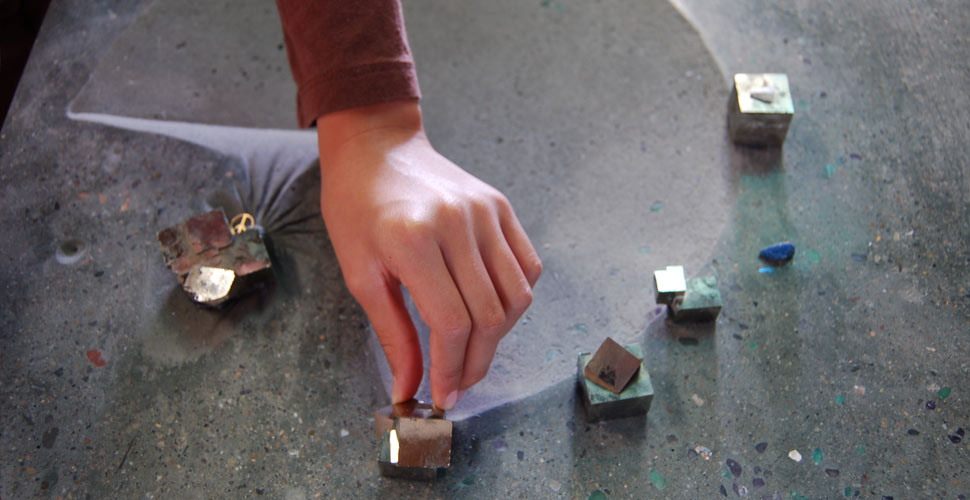
Fu-Tung: There are pyrites in the bottom left corner that look like an overhead view of architectural forms—they’re mineral crystals embedded in the earth representing the Academy’s work in earth sciences, geology and biology. There’s embedded stones and fossils, but more interestingly there’s a vortex-like recessed area that reminds me of a moonscape. In the base, there’s a car valve body cover and a mosaic of chrysoprase I had to cobble together to create a streak of bold color against the amber concrete. Some areas are polished down to expose aggregates and decorative stone and others less so, all to enhance the color and texture.
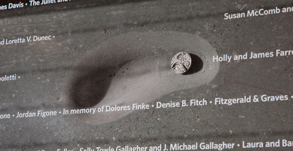
The levity part I was referring to is a peace symbol placed by my then 8-year-old daughter. Her part in it and the peace sign is a reminder of what is needed now and for the future of her generations and beyond.
MORE ON CAS: Sustainable Building Design
The new California Academy of Sciences building, designed by Renzo Piano, is an innovative, prime example of environmentally friendly design—true to the academy’s focus on ecological concerns and environmental sustainability. It received Platinum certification under the LEED program and won the Holcim Award Silver for sustainable construction projects for the region of North America in 2005.
The museum is vast at 400,000 square feet (37,000 square metres) and is a hallmark of environmentally friendly and responsible efforts:
- Produces 50 percent less waste water than previously
- Recycles rainwater for irrigation
- Uses 60,000 photovoltaic cells
- Supports a green roof with an area of 2.5 acres (1.0 hectare)
- Uses natural lighting in 90 percent of occupied spaces
- Construction includes 11 million pounds (5,000 t) of recycled steel
- Wall insulation made from scraps of recycled denim
- Was constructed of over 20,000 cubic yards (15,000 m3) of recycled concrete
Share This Post

